Nature’s Diverse Perfection
Over the past few weeks, I have been building a colour palette from nature.
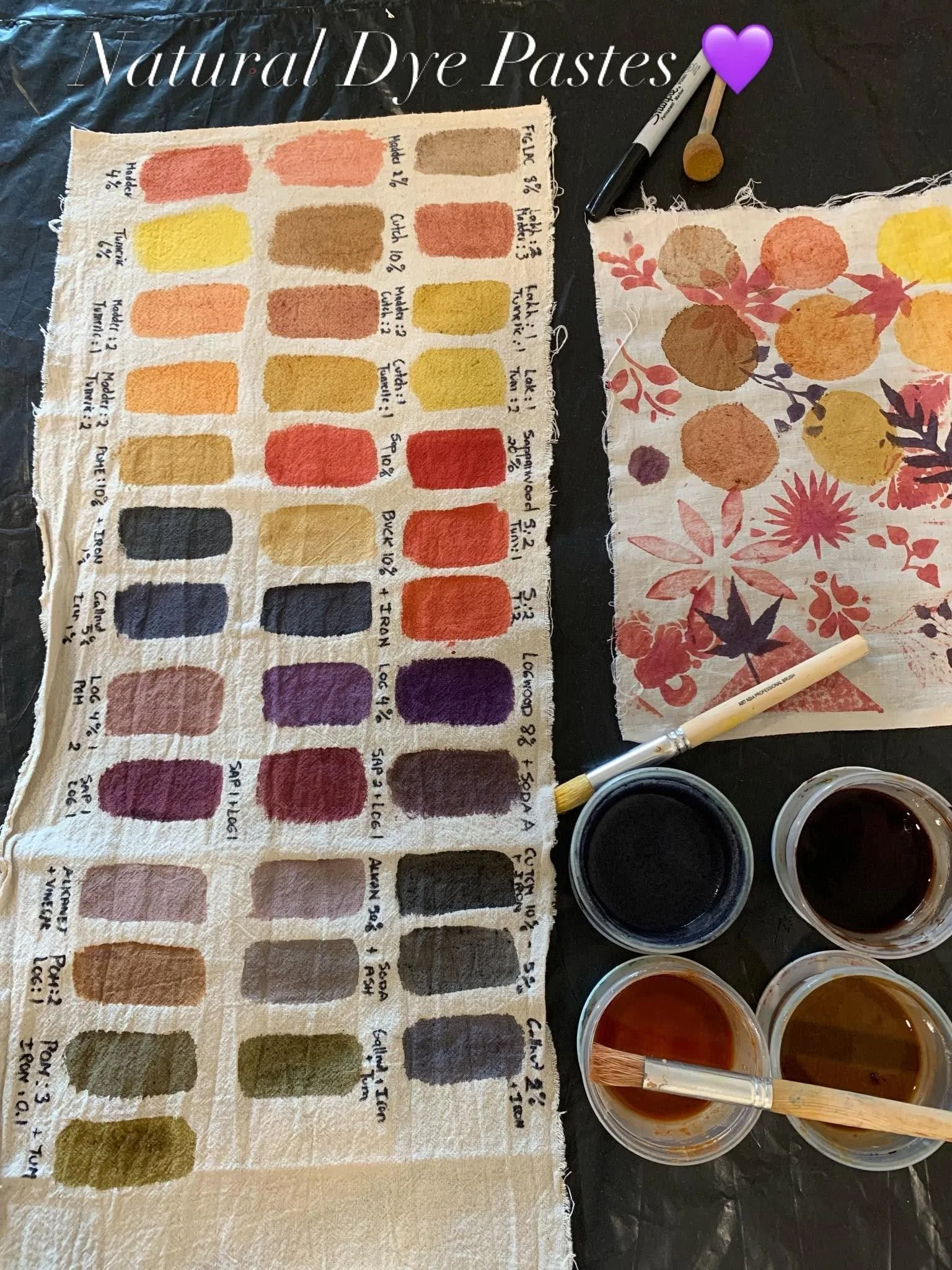
I have been working with flowers, bark, roots, fruit skins, wood chips, seeds and natural dye powders, learning how to extract their colour and turn it into paints and pastes that I can use on fabric.
Little by little, the palette has been growing.
At the moment, I have a piece of cloth covered with almost forty different colour swatches. There are soft pinks and muted golds, earthy reds, gentle greys, dusty purples, warm browns, deep greens and colours that are so subtle and unusual that I am not quite sure how to name them.
Each colour has come from a plant or another natural material. Some have changed through the addition of different mordants. Some have shifted when I altered the pH. Some have surprised me completely by becoming a colour I never expected from the plant I began with.
But when I stood back and looked at all the swatches together, something very simple struck me.
None of the colours clash.
Not one.
Every colour on the cloth can sit beautifully beside another. Some create soft and gentle combinations. Others bring contrast and energy. A pale colour might be enlivened by a darker one. A warm shade might be balanced by something cooler.
But nothing looks wrong together. Nothing feels harsh or out of place. Every colour belongs.
It was such a simple realisation, and yet it stopped me.
There are plenty of synthetic, manufactured colours that seem to fight with one another. We have all seen combinations that feel too bright, too harsh or somehow discordant.
But these colours, all drawn from nature, share an underlying harmony.
Perhaps this should be obvious, but I had simply never seen this so clearly before. And once I noticed it, I began to wonder what else the palette might be showing me.
The colours are not harmonious because they are all alike. They are remarkably different.
Some are strong and rich. Some are soft and almost translucent. Some are warm, others cool. Some immediately draw the eye, while others quietly support the colours around them.
Their harmony does not come from sameness.
It comes from relationship.
Each colour can remain completely itself and still belong beside the others. They seem to carry a common undertone. Even when they are very different, their softness and complexity allow them to sit together without competing.
One does not need to dominate. Another does not need to disappear. A dark tone can give depth to a light one. A vivid shade can bring life to something quiet. Contrast does not become conflict; it becomes part of the beauty.
Perhaps this is one of the lessons nature has always been offering us.
We can sometimes imagine that harmony means everything being smooth, similar or in agreement. We try to remove differences so that things will sit comfortably together.
But nature shows us another way.
A forest is not beautiful because every tree is the same. A garden does not become whole by producing only one kind of flower. A landscape includes roughness and softness, light and shadow, new growth and decay.
Its harmony has room for all of it.
Harmony is not created by making everything the same.
It emerges when each part is allowed to express its own nature while remaining connected to the whole.
This is what these little swatches seem to be showing me.
Forty different colours.
Each one distinct.
Each one beautiful.
And not a single one out of place.